Saturday 19 May 2012

AO4 - Evaluation

I thoroughly enjoyed unit 17 as I felt the near-industry process allowed for me to create almost professional looking products that are fit for audience viewing. The unit allowed for me to show my design skills and express my ideas in a way that the industry would expect and accept.

Firstly, I think all three of my products are fit for release due to their professional look and the popular trend in artist design that they follow.  I like the idea that the house style used upon all three of my products link and establish this era in Sandra Bashful's career. I took inspiration from linking products from Lady Gaga's promotional designs for her latest album and tour, "Born This Way" and "Born This Way Ball" and similarly in the promotional designs for Michael Jackson's post-houmous campaign for his album and film "This is It". By using techniques that the general public are familiar with and not alienating her current fans, I think that my products and Digipack in particular are suitable for all ages, genders and audiences, if not, appealing for all audiences. Sandra Bashful, the fictional character I created for this unit is supposed to represent strong, independent women and has a large following of fans through her confident and extrovert behaviour and I feel that I have represented this well in my products and will appeal to her current audience as well as pulling in new audiences which I think I have succeeded well in. I knew that the promotional flyer for a concert had to be non-audience specific to appeal to a larger group of people and by using themes that Sandra's fans are 'used to', and combining that with a simplistic poster I feel that I have enabled this to occur.


First of all, to begin establishing Sandra's new identity in this era of her career, as requested in the brief, I chose a particular colour scheme of bright yellows and oranges along with contrasting blues and purples - a possible metaphor of Sandra's bright and vibrant personality and style and I think I executed the colour schemes and making them suit in the products well. I particularly like the use of the colours in the programme. To further establish Sandra and make her comeback explosive and stylish, I used explosive and sci-fi looking images to add character to the products and I really like what's happened, especially flyer.


In order to create a professional and industry standard looking product, I used industry used equipment to make sure that the designs were good looking and didn't look rushed. Photoshop was my primary design software, using that to create patterns, effects, edit images of Sandra and I included photographs that I took and mixed them with images on royalty websites such as Getty Images and Istock.  By using such professional companies, I was only able to enhance the professional look of the designs. I think in this unit, I made improvements with my abilities in Photoshop and I think it's reflected in the finished products when compared to original creations in earlier units. In terms of hardware, I used an SLR camera to produce high quality images. Admittedly, I did make a mistake in where I took the photograph, using natural lighting instead of professional photographic lighting and I think this can be seen in the product, and had I had more time I would have corrected. This is one of the very few parts of my designs that I am unhappy with. One definite improvement I would make learning from the mistakes of this unit would be to allow extra time to correct bigger parts of the production such as photography and would encourage others to use set up lighting rather than natural to save impacting on the quality of the work.

By using Photoshop, I was also able to create a 'logo' that could be recognised in all of Sandra's products. The title of "Sandra Bashful" appears, on all three products, in the same font. I think that helps to maintain continuity between the products but also further define this part of her career. The chosen font also enhances the science-fiction feel of the product and the 'out there' persona that Sandra maintains.

I think my response to client matches that of the industry, quickly creating schedules and managing to keep to deadlines that I have set myself. I took on board the advice of the client's representative and followed the trends in recent products like that of Michael Jackson's "This is It", and the promotional campaign of Jessie J's "Nice to Meet You" tour, where they both use a set house style for all official graphics in that section of their career. An example of this is below...

Jessie J's "Nice to Meet You" Poster

Jessie J's "Who You Are" Album Cover

If I was to do the unit again, I would correct and change a number of different things with the products. As said previously, I would take the photographs again with a professional lighting set up to improve upon the already professional-looking product. I would also spend more time with the backgrounds and images used on the products as I felt towards the end of the production, when it came to the programme, I was just quickly adding images without editing or manipulating the images. I would also completely change the look of the programme - in hindsight, it is probably too small to be a programme, contains very little detail and looks rushed so would not be sold as said in the unit for around £3. That is my biggest regret of unit 17.

Thursday 10 May 2012

AO3 - Produce & Present Final Versions for Client

To produce my final versions, I will review my ideas using the feedback from Sandra Bashful's representatives.

Revised schedule
Revised Plan, Resources and Budgets

Final digital version of Digipack


Final digital version of Flyer


Final digital version of Programme (front and back cover)


Final digital version of Programme (inside pages)


Presentation of final designs and information for client

This will include some information from AO2 (drafts to show improvements, etc.)


Final feedback from client


Feedback from focus group

Below is some feedback from a focus group of the target audience of the designed products. Consisting mainly of Sandra Bashful fans, a non specific audience, industry experts and designers.


Wednesday 2 May 2012

AO2 - Respond to a Client Brief

Brief from Client

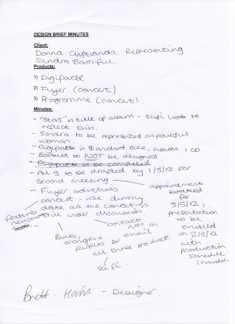
I was brief by a client, Donna Cliftlands, on behalf of the artist "Sandra Bashful" to produce three linked graphic products for said artist. The chosen products are a Digipack artwork, a flyer for a concert in the tour promoting the new album and a programme for the concert. The products should all be linked and follow a house style that would accompany this period in Sandra's career. The new album is called "Stars" and the artwork for the three should link to this album title.

The flyer should use dummy dates as discussions for the booking of the concert in this promotional tour are still under way. A presentation for our second meeting should be created including a plan, initial ideas, schedule, budgets, resources, mood board, hand drawn drafts and digital drafts for feedback. Once editing from feedback is completed, a second presentation should be created with the final digital versions and photographic evidence of the three products.

The promotional tour flyer should predominantly suit the A5 format, but have the ability to be up-scaled to A4 and A3 if necessary. It should advertise the set list, the fact new tracks will be performed and show that it's promoting Sandra Bashful's new album/digipack, "Stars". The programme will be four pages and include lyrics, quotes, set list, etc. The Digipak should be designed to an award winning standard. All three products should follow a linked house style.

The brief will be discussed in the initial meeting with representative for the client, Donna Cliftlands.

PLANNING: Minutes from Initial Meeting from Client


PLANNING: Initial Ideas - Mind Map


PLANNING: Initial Ideas - Mood board

I created a mood board for the three chosen products set out by the client. This mood board sets out the themes and concepts I want to include in my designs.


PLANNING: Production Schedule


PLANNING: Resources & Budgets


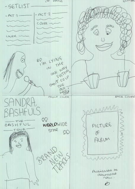
PLANNING: Hand drawn drafts of the three products

Digipack:


Tour Flyer:


Tour Programme:


PLANNING: Digital drafts of the three products

Digipack:


Concert Flyer:


Concert Programme - Front and Back cover:


Concert Programme - First Page, Second Page:


I feel that the three products that I have designed link well with each other not only because they are consistent in their house style but link because of Sandra Bashful's upcoming tour, in which she will require promotional products.

I have kept to a theme of science fiction and explosions of colour and light throughout the whole unit as a means of maintaining the consistency previously mentioned. I think my choices are justified as it suits entirely what was set out in the brief to promote Sandra in a positive and confident light and making this period in her career easily identifiable.

I have kept in time with the schedule and the budgets add up correctly, therefore I think the designs will succeed.

PLANNING: Feedback following second meeting with client


Friday 23 March 2012

AO1 - Analysing a Pamphlet's design


The Shropshire Count Council pamphlet is to inform members of the North Shropshire community of the bin collection times. The target audience for the pamphlet is likely to be adults and home owners. The layout is professional, clear and concise and is everything that I would expect from a council publication. The product follows a green and blue colour scheme which are Earthly colours and colours commonly associated with Shropshire County Council and recycling schemes.

It's target audience is likely to be adults, home owners and tennants over the age of about 23, and both genders and I feel it has been represented well in the pamphlet. I don't think the pamphlet targets people with certain interests as it's likely to be something that's posted through a letter box to every new home owner.

In terms of context, I think that the pamphlet has been proof read and edited a number of times to avoid making it seem gender, age of interest specific. I would picture the pamphlet in a domestic setting that children would also have access to so language and text has been simplified graphologically to make it family friendly and to encourage family activity whilst maintaining a professional feel too. There's frequent use of colloquial language with colours to match to suit a wide audience, like the table on page 4, "No Thanks" in a block red table to make it an easier read.

The colours and layout of the pamphlet flow and represent the unified and friendly face of the council, which I think is important. Had the layout been a linear, black and white structure with bullet points, the likelihood is it wouldn't be read and wouldn't appeal to a wide range of audiences or appeal in general. The fact it appears in a small A5 booklet helps supports my idea of it being family-orientated, as if it's something a child can read or something a parent could read with a child to encourage family activity and to highlight the importance of recycling. There is a high image to text ratio and I think this further supports the idea that the council are trying to come across as doing all they can for a really wide audience.

Thursday 22 March 2012

AO1 - Analysing a Magazine Advert's design

I will be analysing an advert for a  DKNY female fragrance called Golden Delicious that appeared in the Glamour Magazine. Rather than just a page spread in the middle of the magazine, the advert is a double sided, interactive insert at the beginning of the magazine. The prominent section of the magazine and being such a huge advert guarantees that more people would read the advert and hopefully purchase the product. On the front is the main image and advertisement, and on the back is another image with an openable flap which contains the scent of the perfume it's advertising. The advert can be seen in full below...

Advert/Insert Front Cover

Advert/Insert Back Cover (flap can be seen on the left)

Advert/Insert Back Cover (flap open)

The purpose of the advert is to persuade readers of the magazine to purchase DKNY's new fragrance and uses a number of techniques to persuade people to purchase the product. First of all, the advert is placed in a magazine that shares a similar, if not the same target audience of young females (18 to 35) who want to be in the latest styles and trends. The idea that it's for females who want to be in the latest gear is further supported by the adverts' tag line, "the new fragrance for women". The fact that a determiner of, "the" is used suggests it's not just "a" new fragrance in a long line of scents, it's the one everyone wants at the moment and uses this as a marketing ploy to boost sales.

In terms of mise-en-scene, the advert follows a strict colour scheme of golds, light yellow greens and oranges with subliminal use of water droplets and sunlight as the first means of seducing the audience to buying the product. The advert also uses a model who is the most prominent feature of the advert. The advert uses the typical conventions of a perfume ad, where the advert makes a female want to be or be like the 'perfect' model in the advertisement. Ironically, the model has a gap tooth which has become a trend in recent times in the fashion industry. It's almost another subliminal message that even if you have so called 'imperfections', you can still be beautiful and perfect and almost makes audiences want to have imperfections. The model looks seductive in the advert which may appeal to males to buy the product for females, or equally appeal to females who want the confidence to be able to be seductive publicly, although in reality, there wouldn't normally be a need to behave in that manner. The model is also wearing little clothing which could suggest that if the product is purchased, the customer would have the courage to dress in that way too. The little clothing is coloured brown, which follows the colour scale of the advert. Finally, the lighting of the advert is airy and looks like the shot is taken outside, although we can't really tell due to the blurred background and the super imposed apples placed as a layer on top of the model. The lighting appears to come from behind the model, which gives a bright outline to the figure of her which enhances the idea you're supposed to look at the model.

The titles and prominant words on the advert have a positive connotation, for example, "golden" and "delicious" which make the adverts appeal heighten. The fact that most of the text is displayed in light, serif fonts also make the advert crisp and clear and do not make the advert look busy or off putting. I've noticed in the text, there is also a play on words with apples to help the positive connotations of the advert. For example, the title of the fragrance is the same name as a type of apple, "Golden Delicious", at the bottom when advertising it's websites, it says, "join the core club" and finally on the back on the inside of the flap, where it says to smell the sample, "take a special bite".

Something that further backs up the idea that the advert has a young audience is the use of social media such as Twitter and Facebook. This makes the brand more accessible and would make potential customers feel even more included before and after purchasing the product, satisfying them with the potential of gaining more 'beauty secrets' from the accounts. It also supports the idea of exclusivity of the brand and that you should become part of the brand to gain a higher status or exclusivity. This links back to the colour scheme of golds and yellows as being a colour of the rich and high status.

The exclusivity and golden status contradicts the companies values as DKNY was set up as a young persons, more affordable label, which it may still be, but is cloaked by the use of expensive looking items.

The size of the insert is smaller in width than that of the magazine pages as a way of making the magazine, when opened, turn to this page automatically. The fact that it is also interactive and uses thicker paper than other pages in the magazine enhance it's prominence and encourage interactivity with the advert which may persuade people to buy it. It's unusual in terms of a generic print advert but I imagine that it would be a familiar occurrence in fashion publishing as later on in the magazine, there is another similar advert for females by Calvin Klein.

Overall, I think the advert is professional, fit for purpose and completely suits it target audience as described in the analysis. I will definitely be taking inspiration from the advert in my creations by making something that's hopefully unique.

Wednesday 21 March 2012

AO1 - Analysing a Digipak's design

I will be analysing the Digipak and CD packaging for The Beatles' album, Sergant Peppers Lonely Hearts Club Band. The digipak itself follows the standard layout and dimensions of a modern digipak of 139.5 by 6 by 125.5 mm. The chosen digipak contains two panels on each side of the central image, one containing the disk and one containing booklets and images. The Digipak is fast becoming the most popular packaging for discs, albums and singles because it not only appeals because of it's recyclable ability but it allows for more creativity in the look and set up of the packaging.


The digipak consists of bright and vibrant colours, which possibly reflects the vibrant music and attitudes The Beatles portrayed in the swinging sixties. The vibrant and flamboyant colours also clash which could suggest the personalities of the members of the band. The art in Digipaks reflect the artists and appeal to the target audience in order to bring up sales. More often than not, artists will release several different versions of a Digipak or album in order to boost sales and revenue. Something that The Beatles probably have done for this album in vinyl, CD previously with a jewel case, and now a Digipak. I think the emotions and themes in The Beatles Digipaks in general reflect them as a band and as people; fun, vibrant, etc.

At the time of original release, it's likely that the target audience for this Digipak were teenagers, from around 13 to early 20s with a large female to male ratio. However, as this album and The Beatles have become nostalgic and iconic over time, the audience has widened. The younger audience is likely to have declined, but the middle-aged and older audience would be purchasing this to their additional copies as a 'collection', or to just listen again. With the items that come with the Digipak, seen in picture three, it could further back up the point that this is a collectable. It's likely that this Digipak was released in the UK only to further back up the exclusivity and collecting idea. I think the product has a complete fitness for audience for its graphics across the whole of it's releases through the use of several items being included in the Digipak that a huge Beatle fan would want.

The text on the product is part of the image, rather than a text layer placed on top of the image, which is a common convention in recent Digipak designs. On the front cover "Beatles" is made up of flowers and petals in a picture that not only shows the hugely influential style of the sixties, but how much technology has come on since the artwork was originally produced for the vinyl release. By continuing to use the format and convention in the modern Digipack only fuels the iconography and legacy that The Beatles still hold.

The artwork and graphics on this product are the same as the original vinyl and cassette release, which suggests that producers behind the product are trying to keep the nostalgia of The Beatles living by using a coherent house style. I think this further backs up my previous point of collectable items.

The product is full of bright and vibrant colours such as reds, yellows, greens and blues to create a fun and friendly feel about The Beatles and to flaunt the idea that The Beatles are suited to any age and genre and do not have a specific audience. The cover included pictures of famous icons of the 60s which would appeal to a large audience at the time of it's original release and a large audience today due to the iconography and nostalgia that comes with it.

I feel that the product is efficient and effective and is fit for an audience of today not because of it's friendly and vibrant feel but because of it's iconography and that's why it hasn't been changed since it's release.

Tuesday 20 March 2012

AO1 - Analysing a Film Poster's design

I will be analysing the theatrical film poster for "Paranormal Activity 3" - it's purpose is to promote the film's release. The film was released in 2011 following an extensive promotional campaign involving trailers, websites and social media (and social media competitions), like Twitter and Facebook. The trilogy has developed from being an independent film ("Paranormal Activity") to a blockbuster series ("Paranormal Activity 2" and "Paranormal Activity 3") with production and promotion being acquired by Paramount. The poster itself is in portrait format and follows the standard dimensions of a theatrical poster, 27 by 41 inches and will have been printed on the standard photographic paper that film posters typically are. 


"Paranormal Activity 3" is a horror and the genre of the film is reflected in the poster through use of house style, colour, effects and layout. To begin with, the poster's background is black which already has a connotation of evil or something lurking in the dark, one of the films running themes. The dark also contrasts with the bright white text used to promote the film, especially the text "coming soon" and the tag lines, "Discover how the activity began" and "It runs in the family". I also think that the white reflects the events that occur within the film as it's "in your face", much like the jumps and the paranormal activity that you see on screen. The red title also contains connotations of evil and blood but a blur effect that makes the title seem slightly distorted has connotations of evil and something quick occurring. There is use of blue text for the credit block and the "3" on the poster which could suggest the cool temperature that occurs when bad spirits are near. The poster follows the house style of the promotional trail that the film had in it's trailers, other posters and the website, www.paranormalmovie.com. The typewriter font style is used across the promotions for the film and reflects the fonts used on old video cameras, another running theme in the film. The text alignment is disturbed, especially on the line on the top third, "Discover how the... action began". Not only is the sentence split over two lines and aligned differently, but there is an overlap of the words "the" and "action", which could be designed to make you feel uncomfortable. The producers of the poster also assume that an audience would have at least seen the previous film, if not, both of the prequels. This text also reflects the events in the film as a typewriter effect marks the changes in the time within the movie, and the style in which the line is written is identical to how it is presented in the movie - simplistic. The poster also follows a rule of thirds with the middle and bottom third containing most of the action. The poster is simple and this reflects the simplicity of the filming techniques used in the movie.

The suspicious and enigmatic messages put forward in the poster are mainly visual through the use of the image in the middle third of the poster. The main image on the poster is a picture that suggests something to come in the movie. The image features two young girls in bed with the shadow of what could possibly be a spirit haunting them. It's likely that a target audience wouldn't need foreknowledge to understand the message meant by the shadow, but a target audience would recognise the suspicious theme in the image and therefore, this could be used as a means to lure in customers and generate revenue. The image also suggests and symbolises a sinister motive within the movie with the connotation of, as said before with the colour scheme, something lurking in the dark, a common convention of the horror genre.

The credit block on the poster is small which helps the minimalist feel of the poster. This, in conjunction with the large margins of the poster help to uphold the simplicity of the promotion. Unlike the common convention of non-animated films, the poster doesn't feature the stars of the movie as a unique selling point. The enigmatic image is used to lure in customers. The "Paranormal Activity" franchise does not use famous movie stars throughout the films as a means of keeping the narratives natural and real. Because of this, the unknown actors aren't flaunted in their publicity and promotional trail, and are not used as a unique selling point. Equally, the promotional trail and especially the theatrical poster does not use it's own hype to promote the film, something that's not usual in the advertising process of the production. The evidence of this is the fact that no critic or newspaper quotes are published on the poster. The fact that the movie doesn't rely upon quotes and stars shows that the franchise has become an institution.

I think the main attention drawn to the poster would be from the disturbing image and the blurry, blood red title of the movie and that the target audience the poster is inviting to watch the film to is young people, both male and female, who are around the age range of 15-24 and are typically fans of the horror and thriller genre.

I feel that the poster works appropriately and completes exactly what it sets out to achieve. By just looking at the poster, I would want to see the trailer or movie to make up my mind. The fact that the poster explains other action has occurred not only lures me into the movie but the whole franchise.