Advert/Insert Front Cover

Advert/Insert Back Cover (flap can be seen on the left)

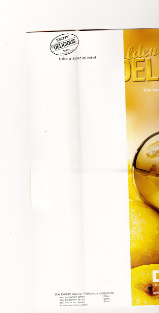
Advert/Insert Back Cover (flap open)
The purpose of the advert is to persuade readers of the magazine to purchase DKNY's new fragrance and uses a number of techniques to persuade people to purchase the product. First of all, the advert is placed in a magazine that shares a similar, if not the same target audience of young females (18 to 35) who want to be in the latest styles and trends. The idea that it's for females who want to be in the latest gear is further supported by the adverts' tag line, "the new fragrance for women". The fact that a determiner of, "the" is used suggests it's not just "a" new fragrance in a long line of scents, it's the one everyone wants at the moment and uses this as a marketing ploy to boost sales.
In terms of mise-en-scene, the advert follows a strict colour scheme of golds, light yellow greens and oranges with subliminal use of water droplets and sunlight as the first means of seducing the audience to buying the product. The advert also uses a model who is the most prominent feature of the advert. The advert uses the typical conventions of a perfume ad, where the advert makes a female want to be or be like the 'perfect' model in the advertisement. Ironically, the model has a gap tooth which has become a trend in recent times in the fashion industry. It's almost another subliminal message that even if you have so called 'imperfections', you can still be beautiful and perfect and almost makes audiences want to have imperfections. The model looks seductive in the advert which may appeal to males to buy the product for females, or equally appeal to females who want the confidence to be able to be seductive publicly, although in reality, there wouldn't normally be a need to behave in that manner. The model is also wearing little clothing which could suggest that if the product is purchased, the customer would have the courage to dress in that way too. The little clothing is coloured brown, which follows the colour scale of the advert. Finally, the lighting of the advert is airy and looks like the shot is taken outside, although we can't really tell due to the blurred background and the super imposed apples placed as a layer on top of the model. The lighting appears to come from behind the model, which gives a bright outline to the figure of her which enhances the idea you're supposed to look at the model.
The titles and prominant words on the advert have a positive connotation, for example, "golden" and "delicious" which make the adverts appeal heighten. The fact that most of the text is displayed in light, serif fonts also make the advert crisp and clear and do not make the advert look busy or off putting. I've noticed in the text, there is also a play on words with apples to help the positive connotations of the advert. For example, the title of the fragrance is the same name as a type of apple, "Golden Delicious", at the bottom when advertising it's websites, it says, "join the core club" and finally on the back on the inside of the flap, where it says to smell the sample, "take a special bite".
Something that further backs up the idea that the advert has a young audience is the use of social media such as Twitter and Facebook. This makes the brand more accessible and would make potential customers feel even more included before and after purchasing the product, satisfying them with the potential of gaining more 'beauty secrets' from the accounts. It also supports the idea of exclusivity of the brand and that you should become part of the brand to gain a higher status or exclusivity. This links back to the colour scheme of golds and yellows as being a colour of the rich and high status.
The exclusivity and golden status contradicts the companies values as DKNY was set up as a young persons, more affordable label, which it may still be, but is cloaked by the use of expensive looking items.
The size of the insert is smaller in width than that of the magazine pages as a way of making the magazine, when opened, turn to this page automatically. The fact that it is also interactive and uses thicker paper than other pages in the magazine enhance it's prominence and encourage interactivity with the advert which may persuade people to buy it. It's unusual in terms of a generic print advert but I imagine that it would be a familiar occurrence in fashion publishing as later on in the magazine, there is another similar advert for females by Calvin Klein.
Overall, I think the advert is professional, fit for purpose and completely suits it target audience as described in the analysis. I will definitely be taking inspiration from the advert in my creations by making something that's hopefully unique.
No comments:
Post a Comment